To make our content shine, and to make viewers see it and choose it, we need good images and effective pitch texts. This article provides you with tips, specifications, and guidelines for delivering images and text for NRK TV use.
We require four types of images:
1. Key art
The key art is the poster or identifier of a series or a programme. It is displayed on the front page, in searches and in category listings in NRK TV, as well as on third party platforms. A universal search on an Apple or Google unit will produce the key art images. Key art may be for an entire series, seasons of series or stand-alone programmes.
Requirements:
Keeping in mind the premise of the plot, formulate a good “nutshell description” of the situation. Use the tools of typography, colors, photography, and illustration to convey this clearly.
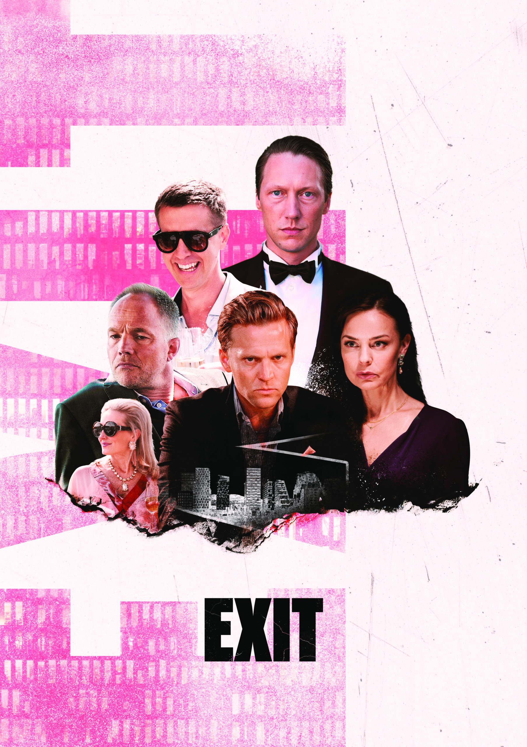
Example: «Exit»
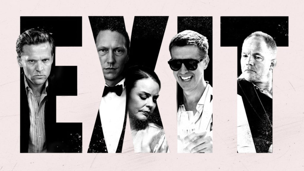
They have money, careers, families. They have everything – but they are bored. Dark, shocking drama series set in Oslo’s finance community.
Gist of the story: Finance. Money. Dark. Shocking.
Situated in: Oslo financial community.
✅ Key art succeeds in conveying:
Gist of the story
Money: men in dark suits
Dark and shocking: conveyed in facial expressions
Situation
Oslo financial community: Scandinavian people. Pink – “the colour of finance (newspapers)”
⛔ Potential for improvement:
Gist of the story
Could other elements convey the premise more clearly? In particular, the shocking aspect?
Situation
Oslo: could details of imagery enhance the focus? For instance, inserting the skyline of the “Barcode” business district behind the dark lettering?
Pink: maybe a stronger shade could convey identity more clearly?
The series or program’s logo, i.e., the name of the series, must be included in the key art. The logo should be visually expressive – and be easily identifiable.
Programme or series logo, meaning the graphic representation of the name, must be included in key art. A logo needs to have a clear visual idea and be recognizable.
What makes a good logo?
Expressivity (characteristic design)
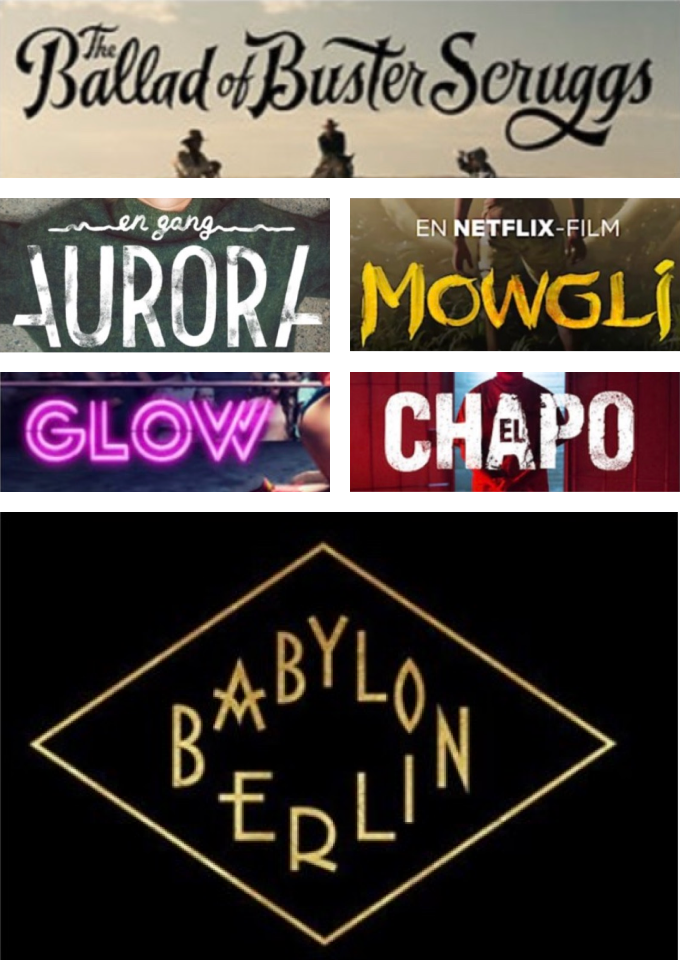
Very expressive
These logos convey the content well.
Fairly expressive
Conveying a simple, but clear idea.
Not so expressive
Attempt at conveying a “worn” impression, but the effect is hardly visible. Further, is that an appropriate idea for this series?
Inexpressive
This font says nothing about the content.
The portrait format and the landscape format must be perceived as similar
✅ Example: Lik meg
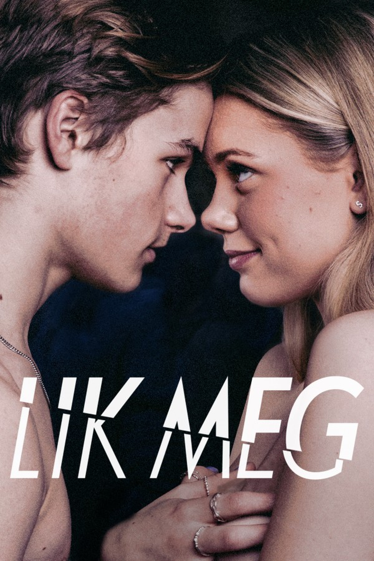
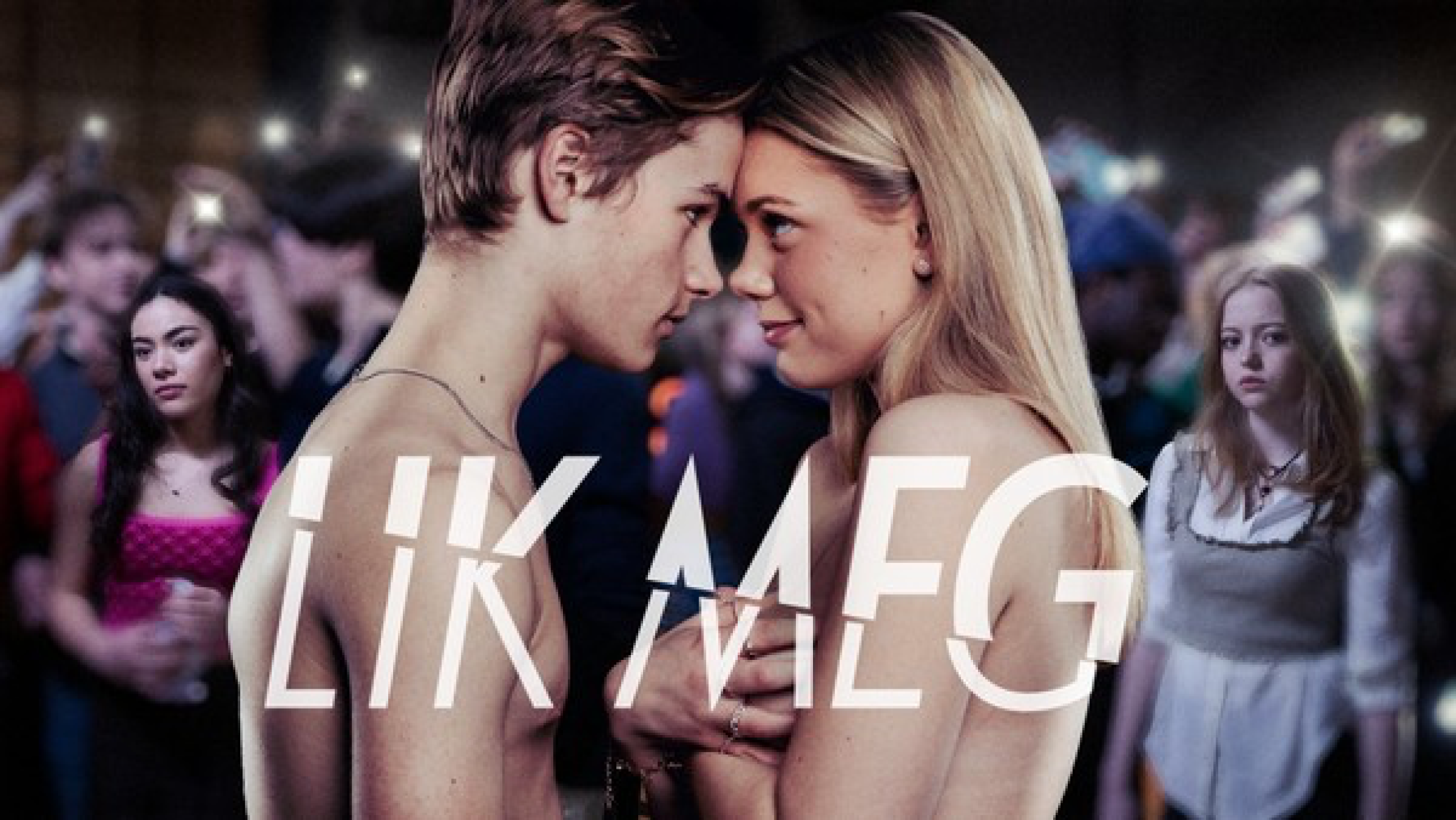
Portrait and landscape key art feel the same. Easily recognizable.
❌ Example: Exit
Portrait and landscape key art are too dissimilar.
The key art logo should resemble the logo used in the opening.
✅ Example: Vikingane
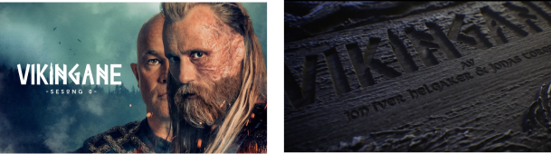
Similar logos used in opening and key art
❌ Example: Exit
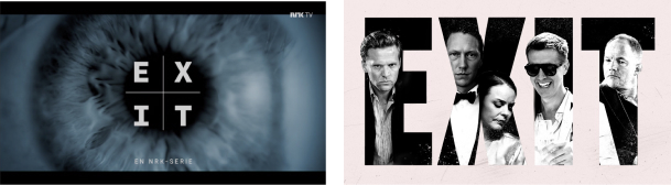
Dissimilar logos in opening and key art
NRK TV images are typically shown in (relatively) small sizes, even when viewed on a big screen. Key art must be simple enough to come across well in small sizes. Avoid including too many people, elements or details.
❌ Example: Exit

In thumbnail size, the logo and characters will be too small.
Some series consist of stand-alone episodes, making the episode content more important than the series. Typically the topic, the guest(s) or the main character constitute the main motivation for wanting to watch the show. Such series requires episode key art.
Examples
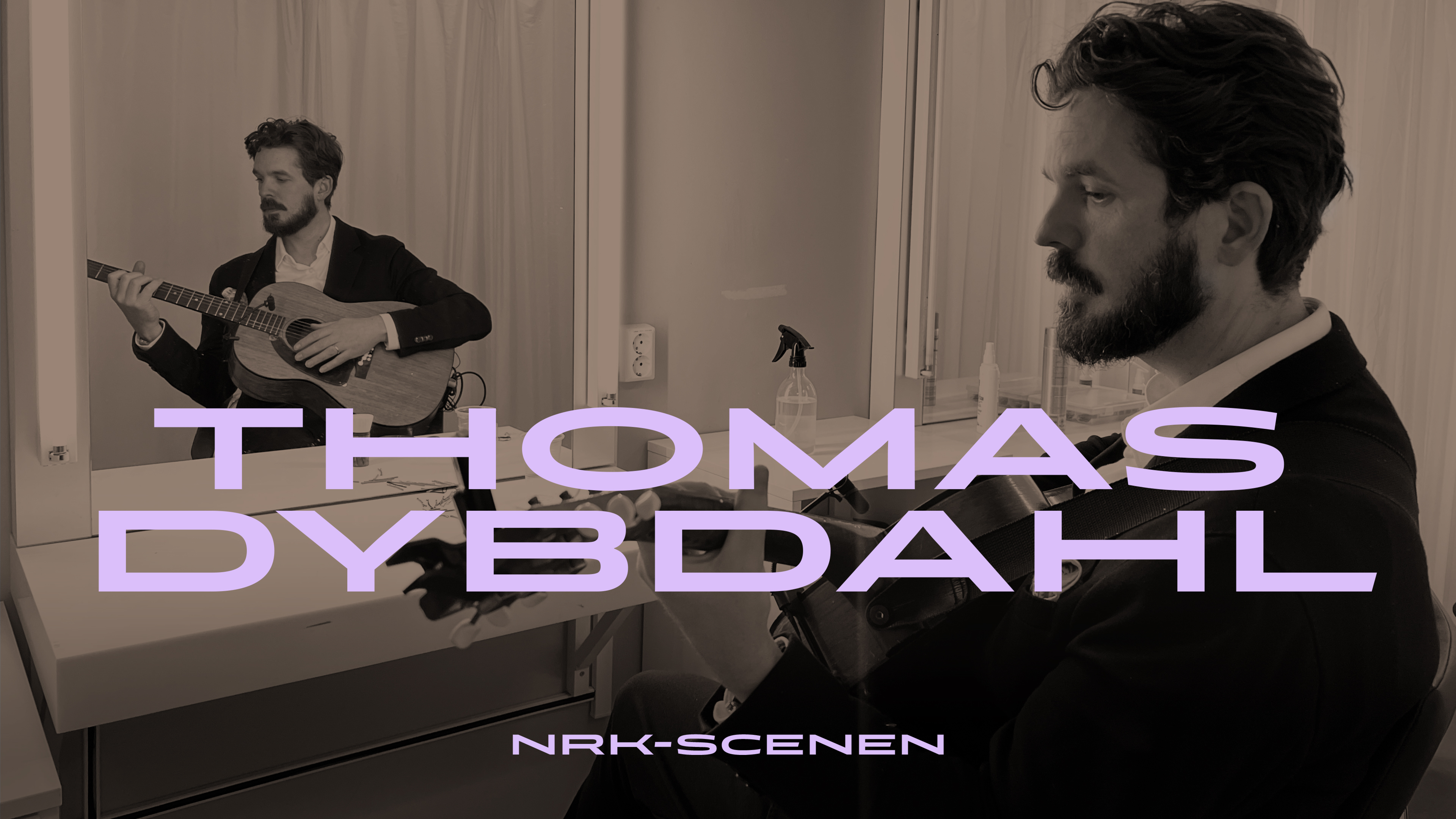
NRK-Scenen
“Tiny Desk concert” style series, a different performer for every episode
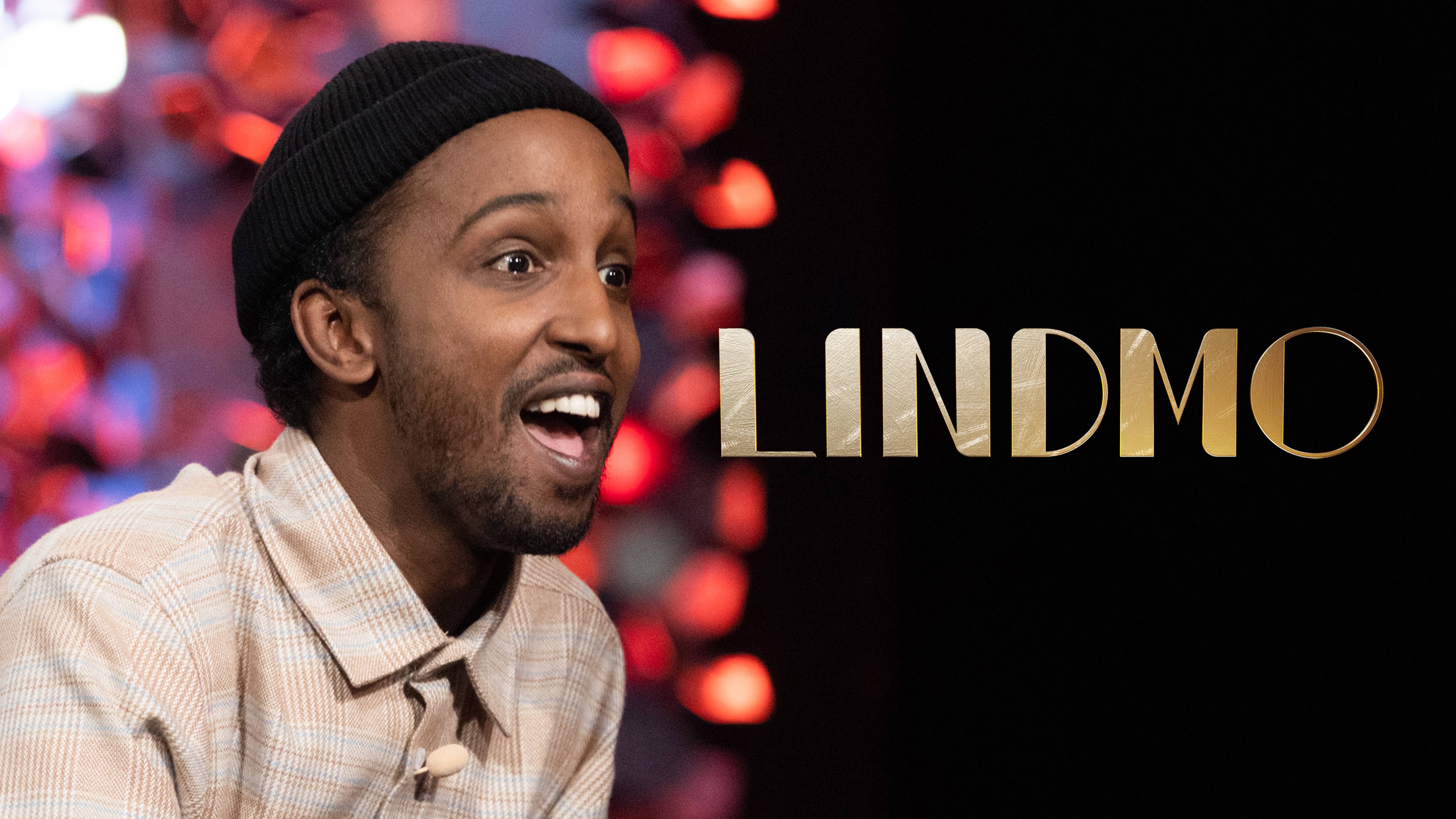
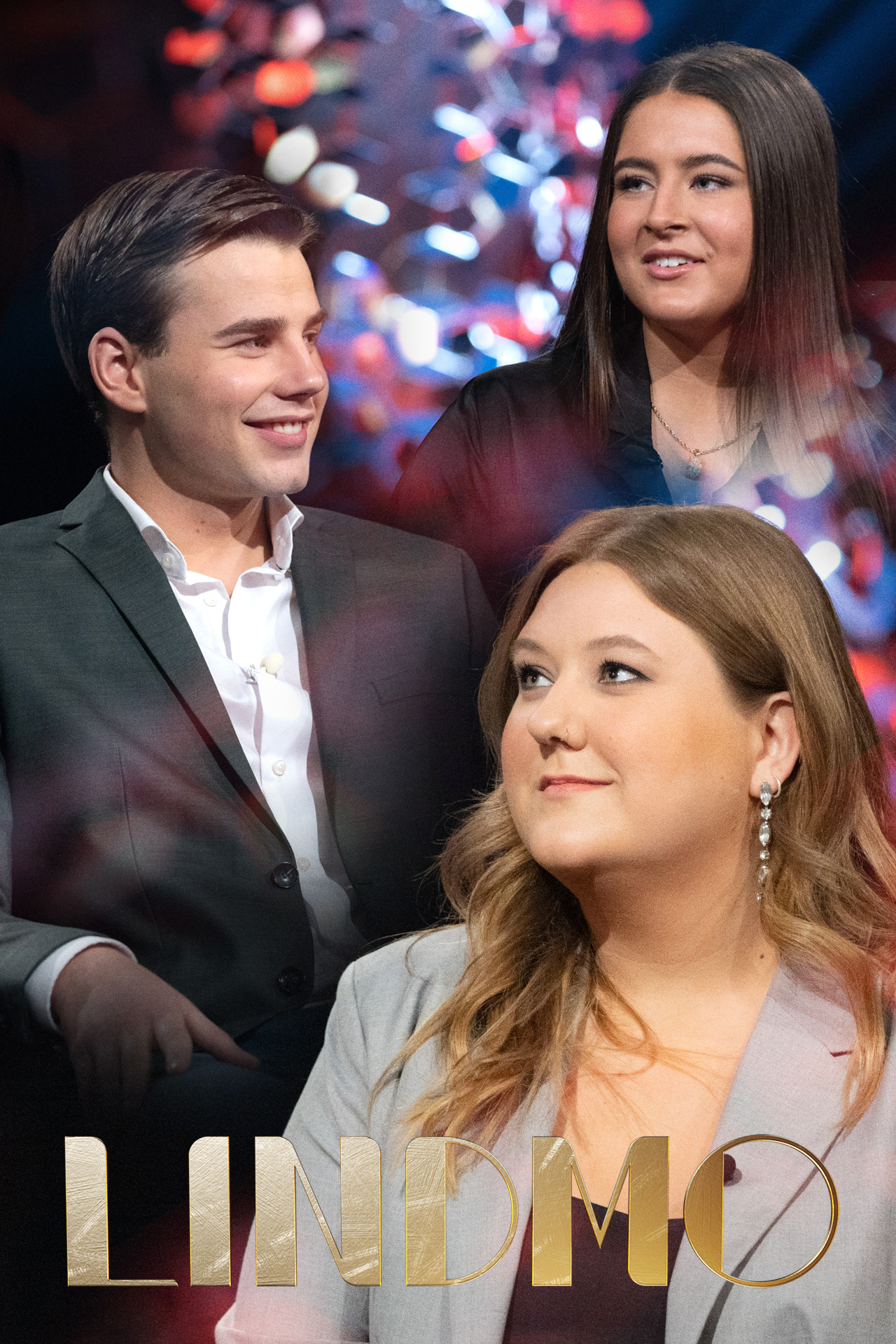
Lindmo
Talk show, new guests for every episode
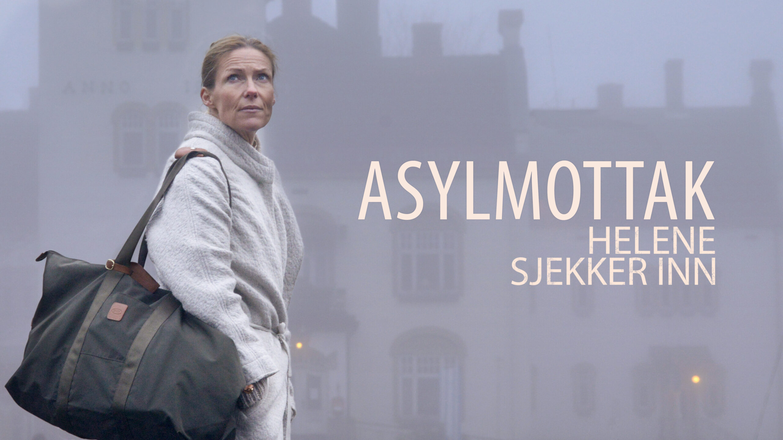
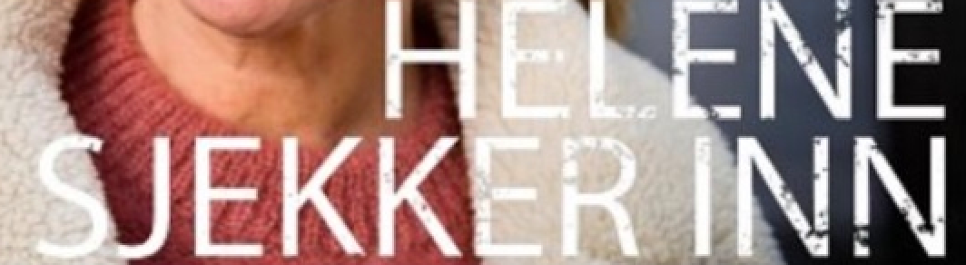
Helene sjekker inn
A different location for every episode
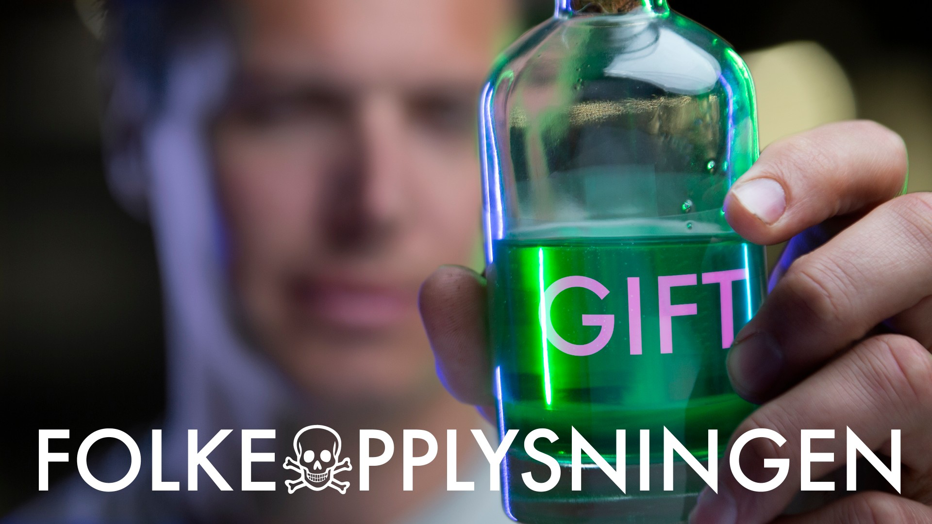
Folkeopplysningen
Popular science series, a different topic for every episode
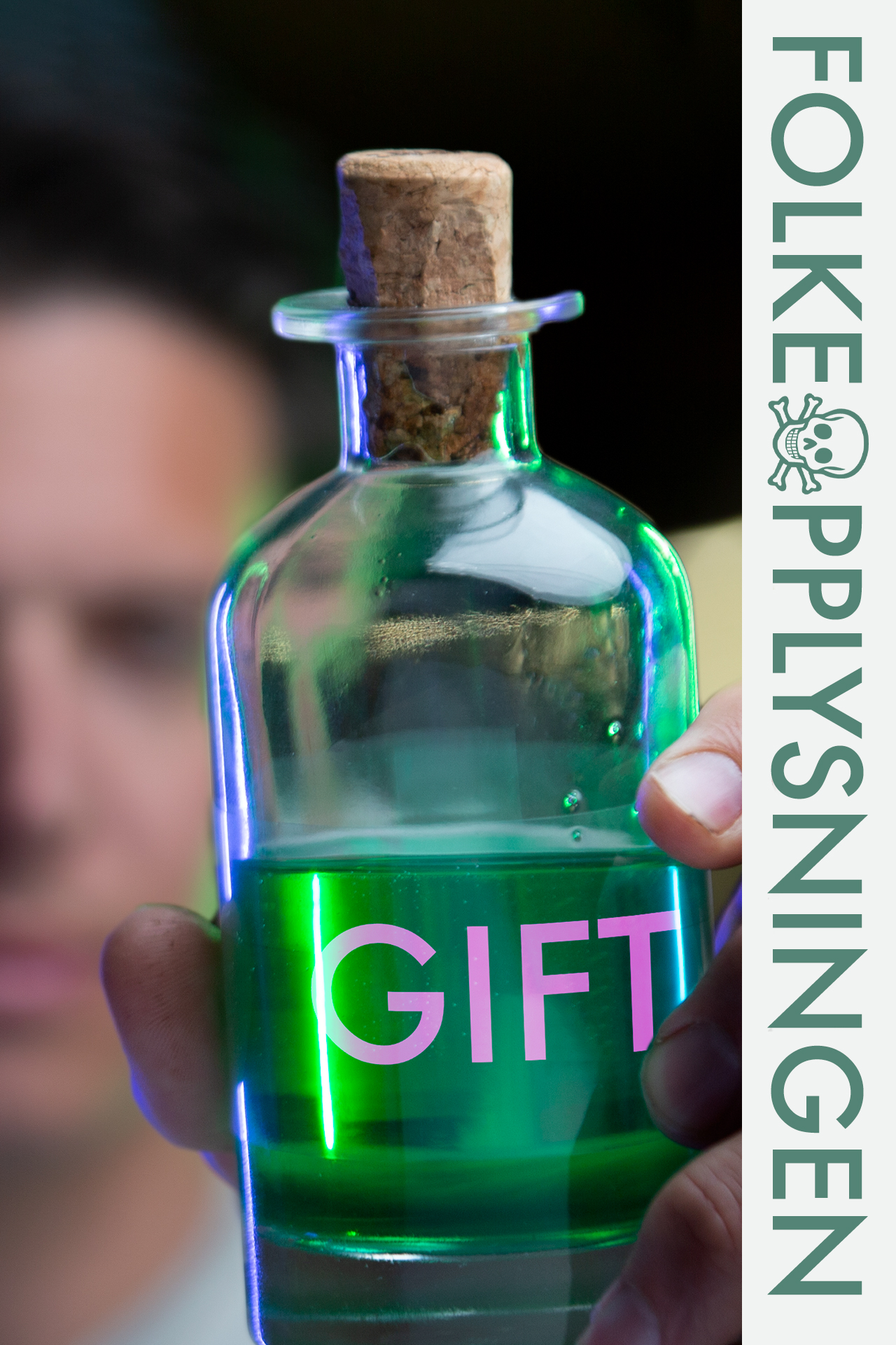
All episode key art should come in both portrait and landscape format.
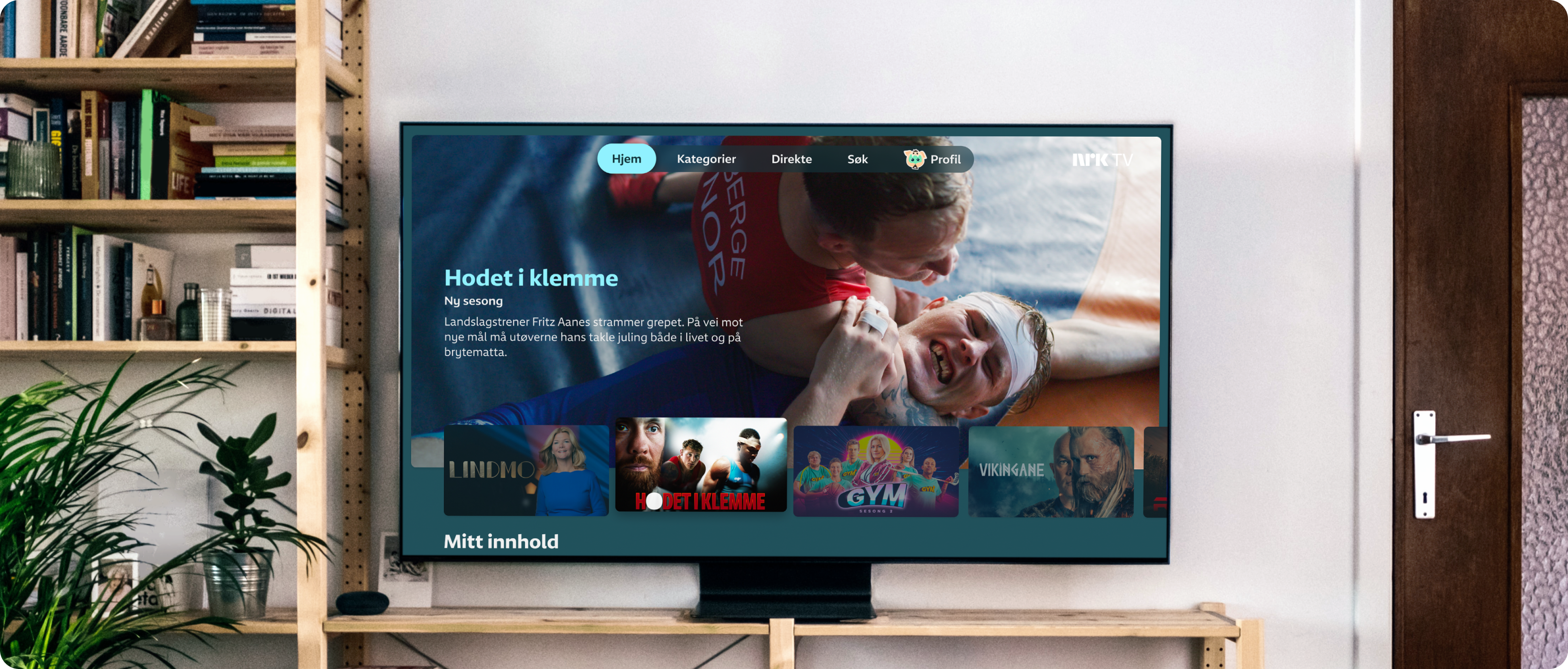
The background colors in NRK TV are automatically generated based on the colors values in the focused key art. Upload the image to see which color is generated.
NRK TV background colours are determined by the colours in the focused key art – thus, the content colours the site. Upload your key art image to see the background colour it will generate.
Key art should never include:
- Names of cast or crew
- Taglines
- Awards
- Stars or grades from reviews
- Production company logos or graphics of a similar kind
Background images
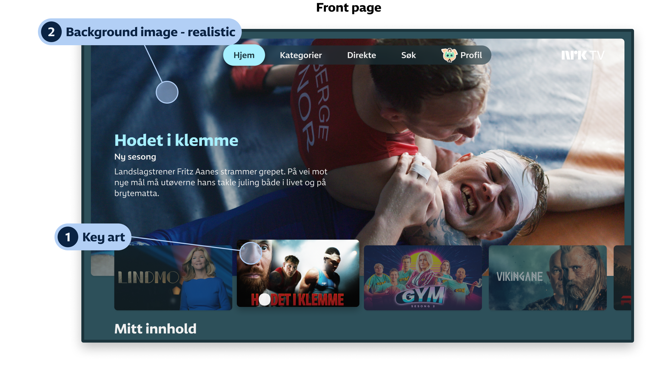
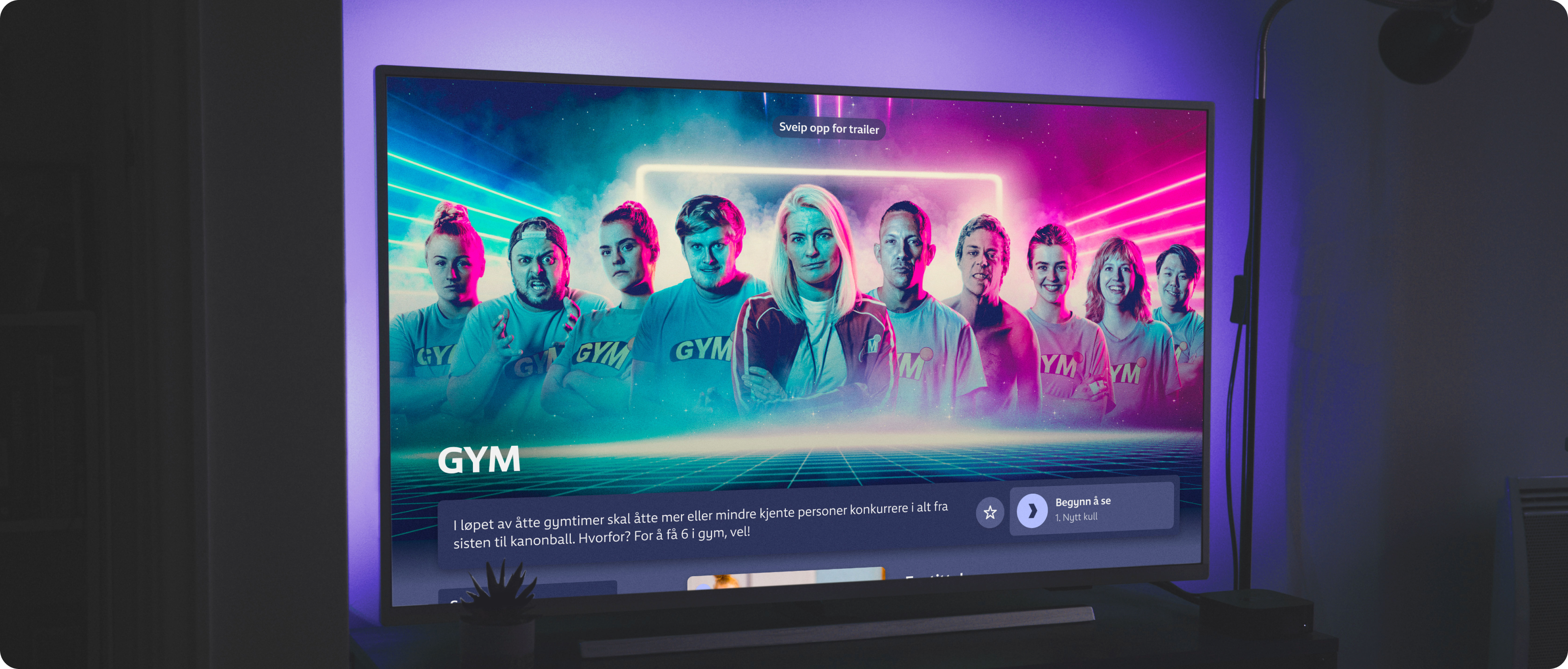
2. Background image – realistic
The realistic background image should convey the content in an honest, representative way. It acts as a complement to the key art, providing an impression of what the viewer may actually see in the programme.
Provide the viewer with a further idea about the content by focusing on important characters or visually enhancing a mood.
✅ Example: 110
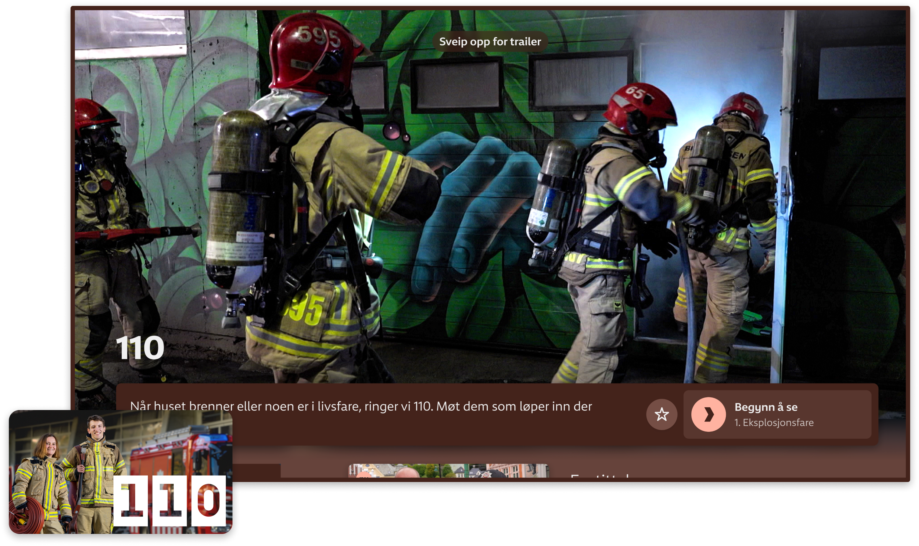
The image focal point should be from the middle towards the right side, so as not to collide with the user interface elements.
✅ Examples
Image focal point in the middle
Image focal point to the right
❌ Examples
Main image element on the left side
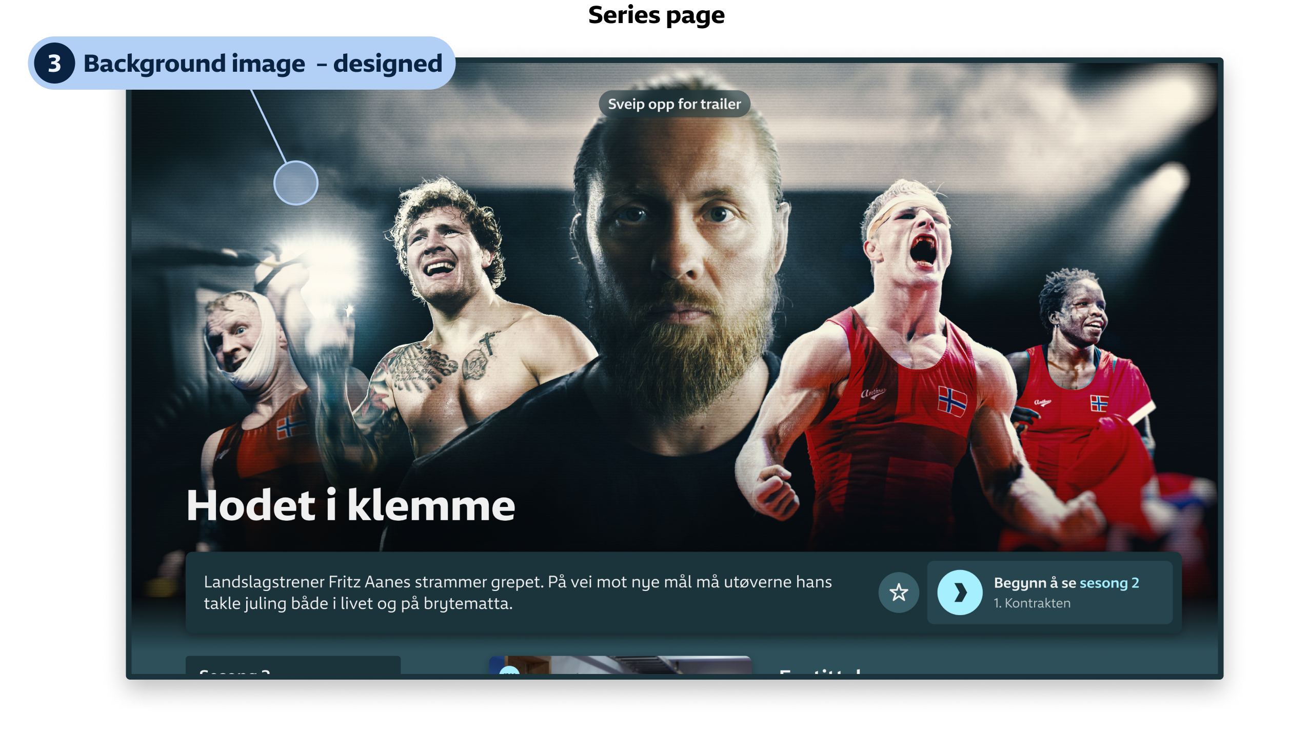
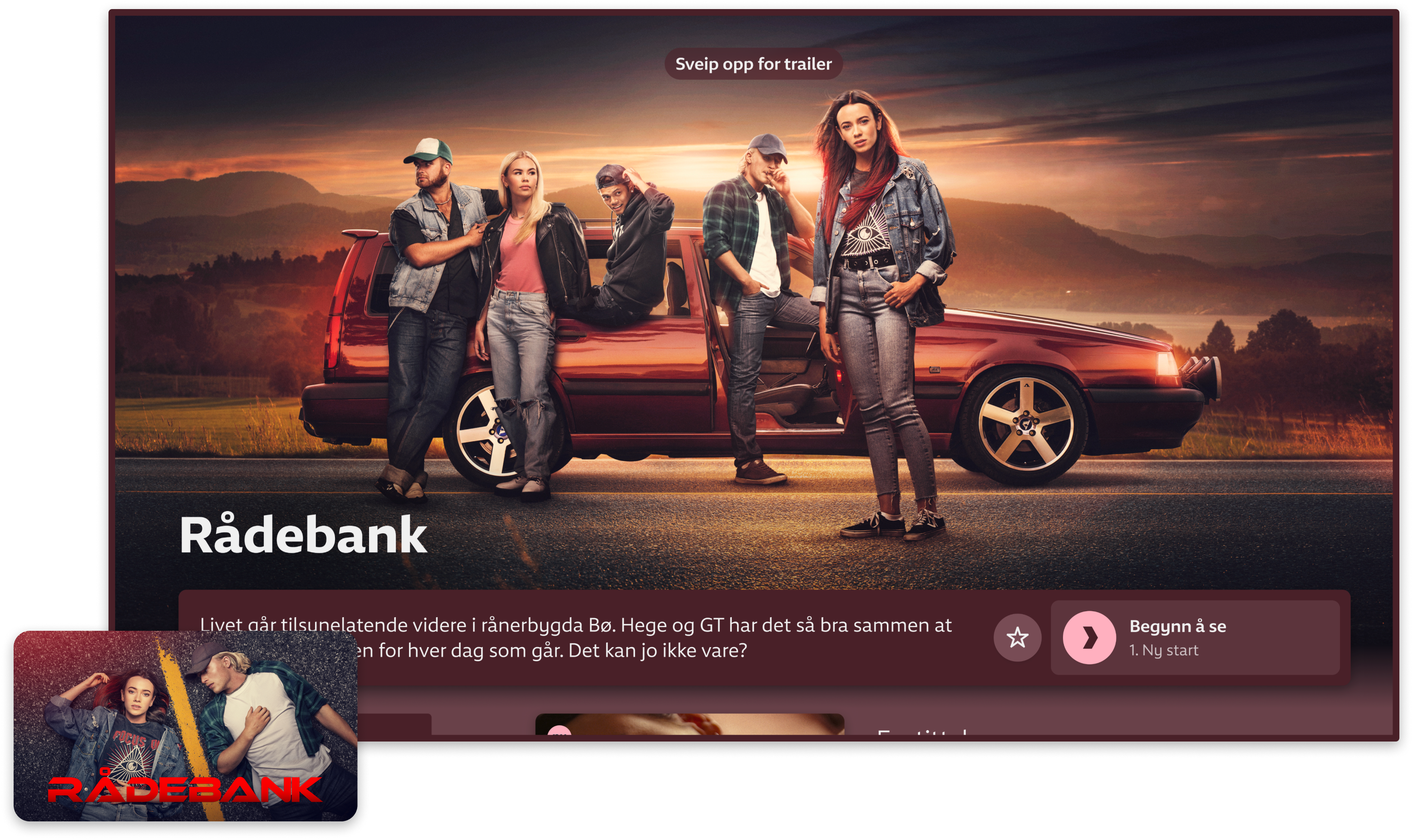
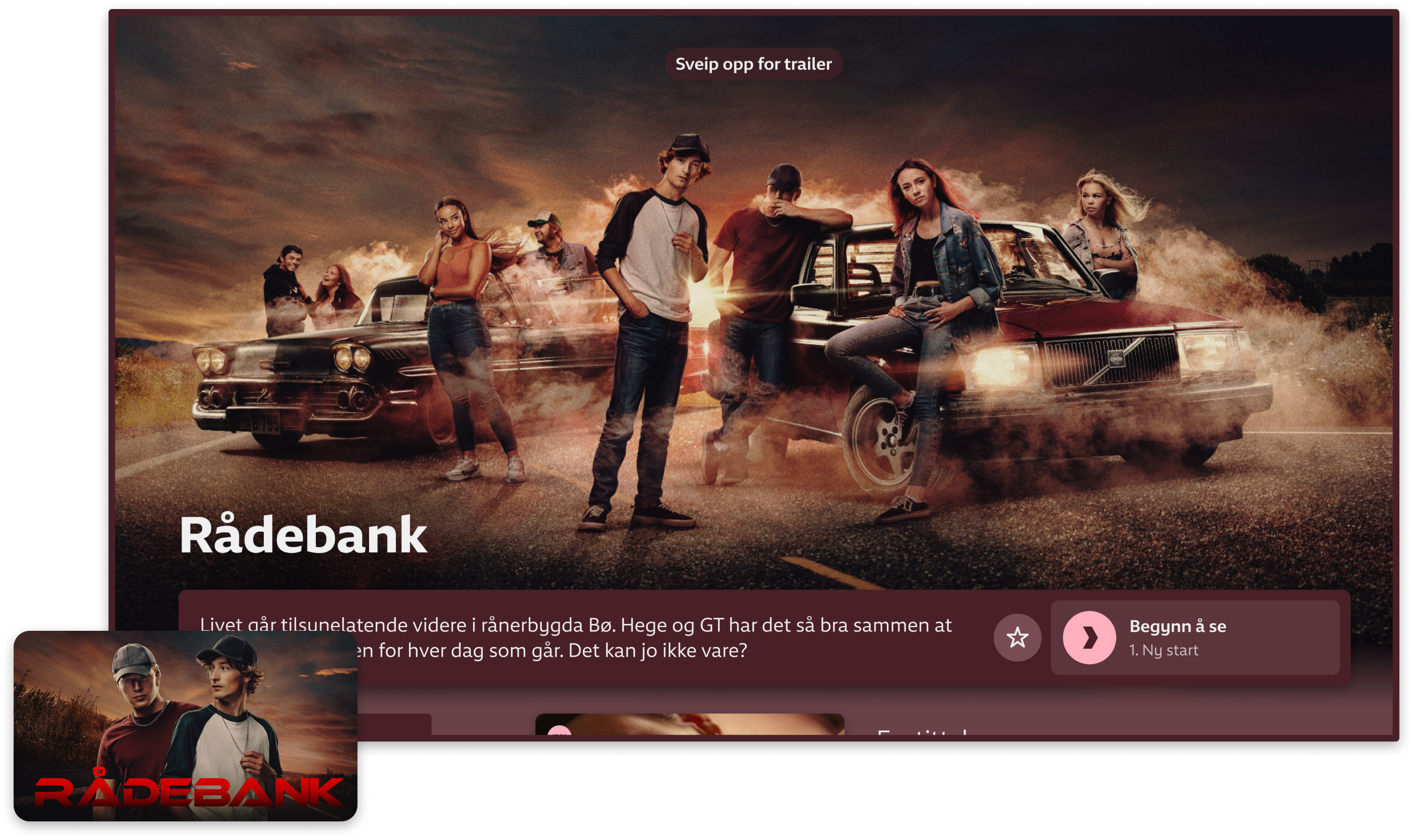
3. Background image – designed
The designed background image should resemble the key art. Similar to the realistic background image, it should give the audience a broader understanding of the content, but the motif doesn’t have to be a screen shot from the content itself.
The graphic identity of a programme is established in the key art and should be carried forward in the designed background image. This will ensure a coherent user experience.
The colours of the series page in NRK TV is generated from the colours of the key art. The designed background image must resemble the key art to harmonize with the surrounding interface.
✅ Example: Rådebank
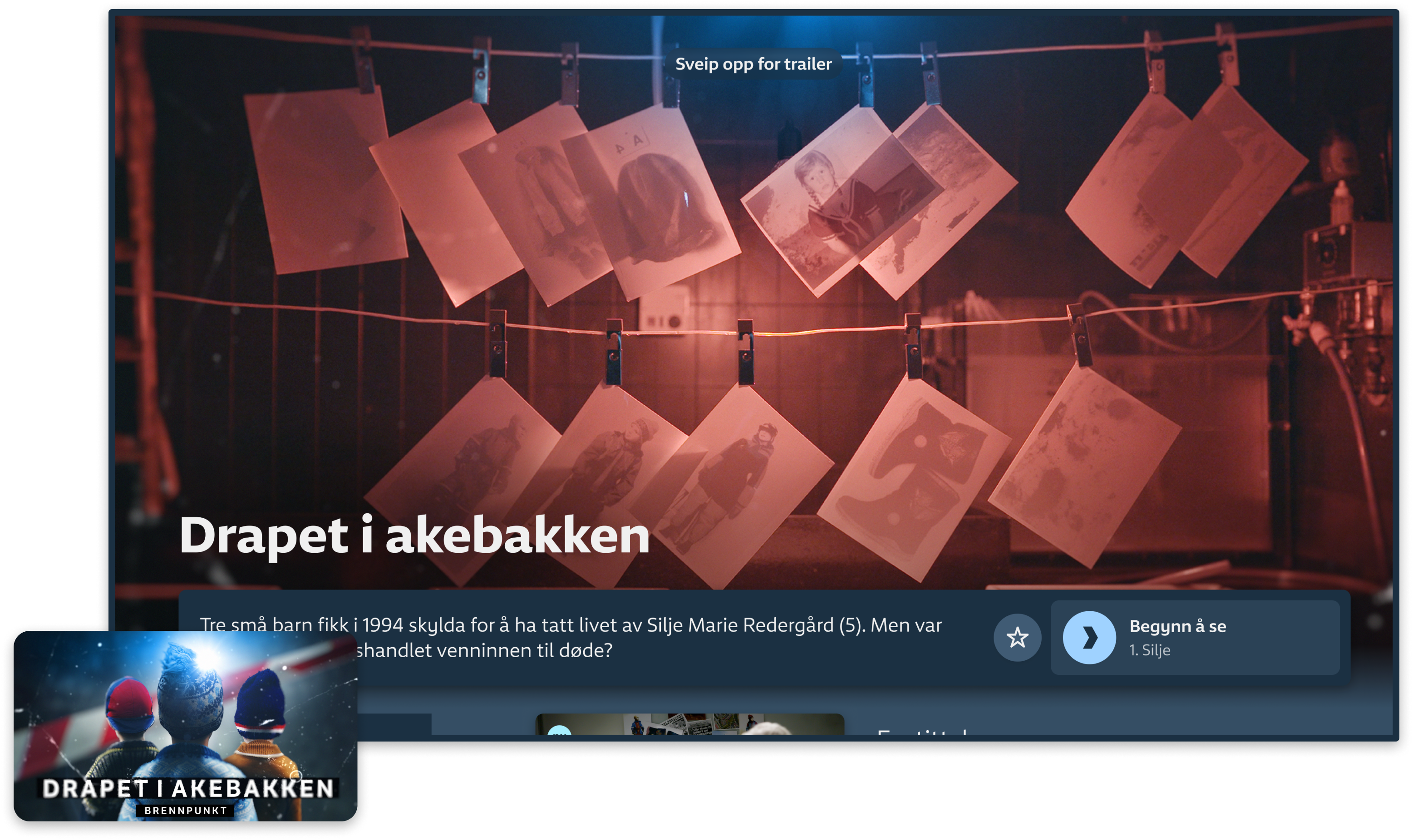
✅ Example: Drapet i akebakken
Expand the story conveyed through the key art that caught the attention of the audience. Add information by showing where and when the narrative takes place, promote important members of the cast or amplify a certain ambiance. Do not replicate the motif of the key art.
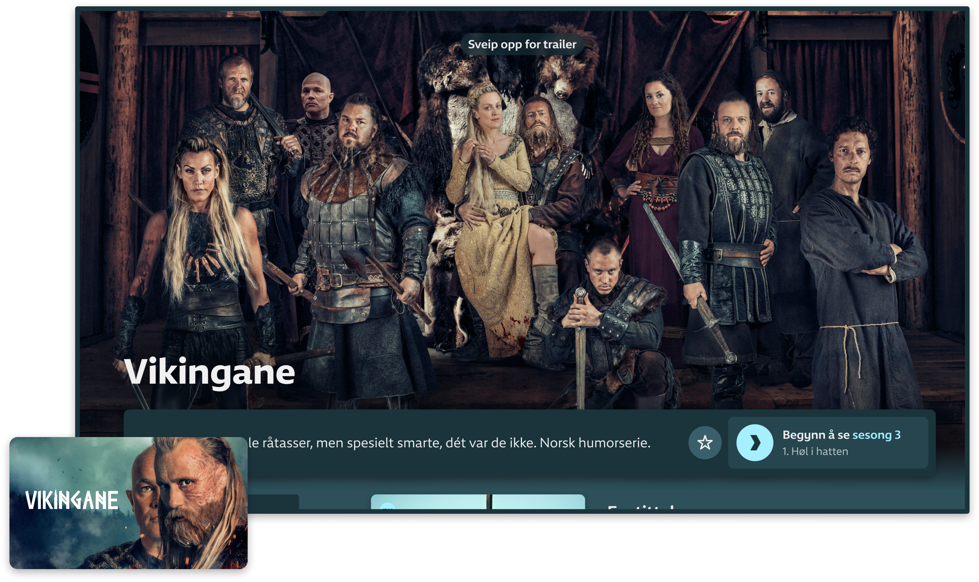
✅ Eksempel: Vikingane
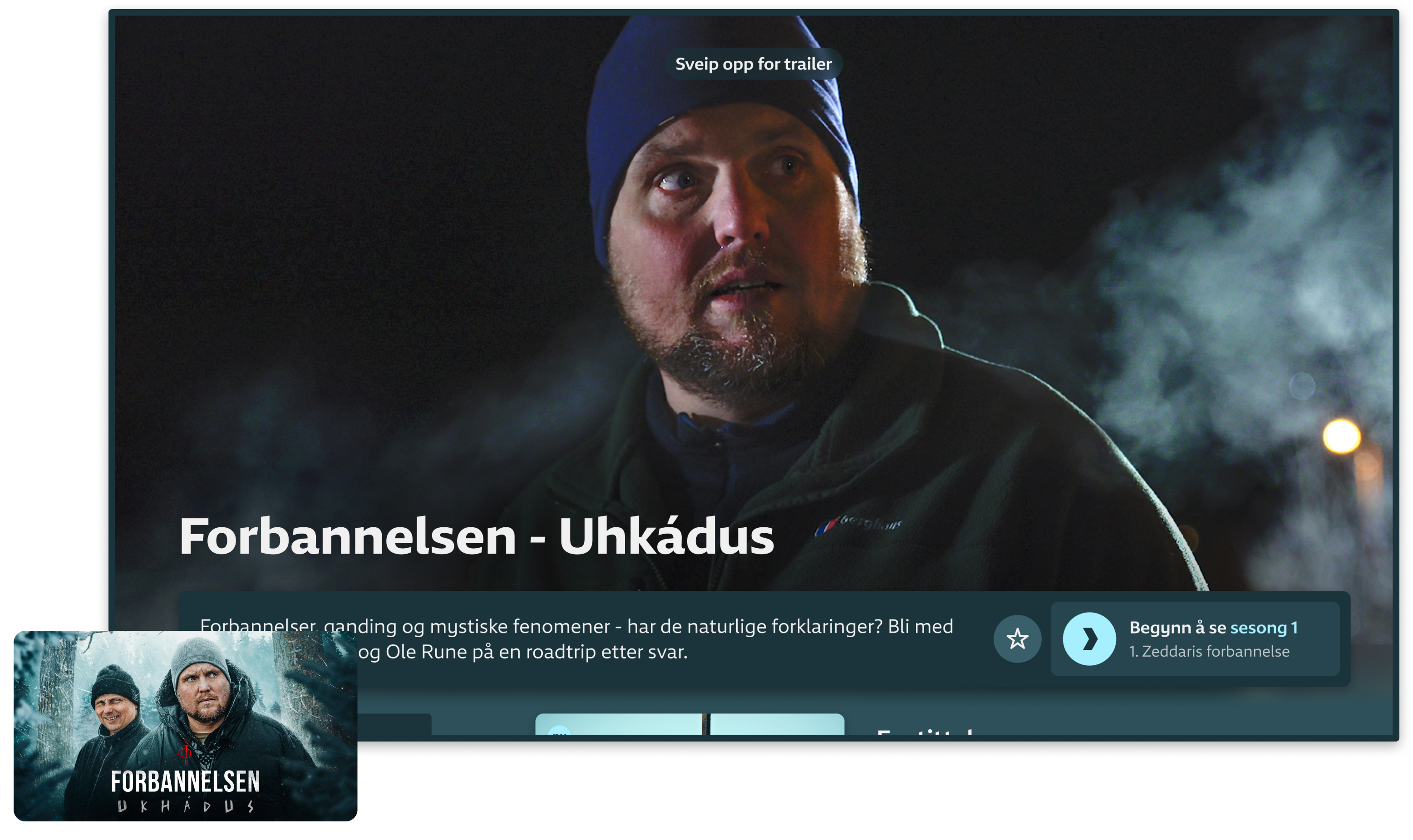
❌ Eksempel: Forbannelsen
The image should convey the visual identity of the show, but also reflect the content accurately. It should represent what the audience can expect to see when they watch the program, so that they are not disappointed by dissimilarities between the promotion of the show and the show itself.
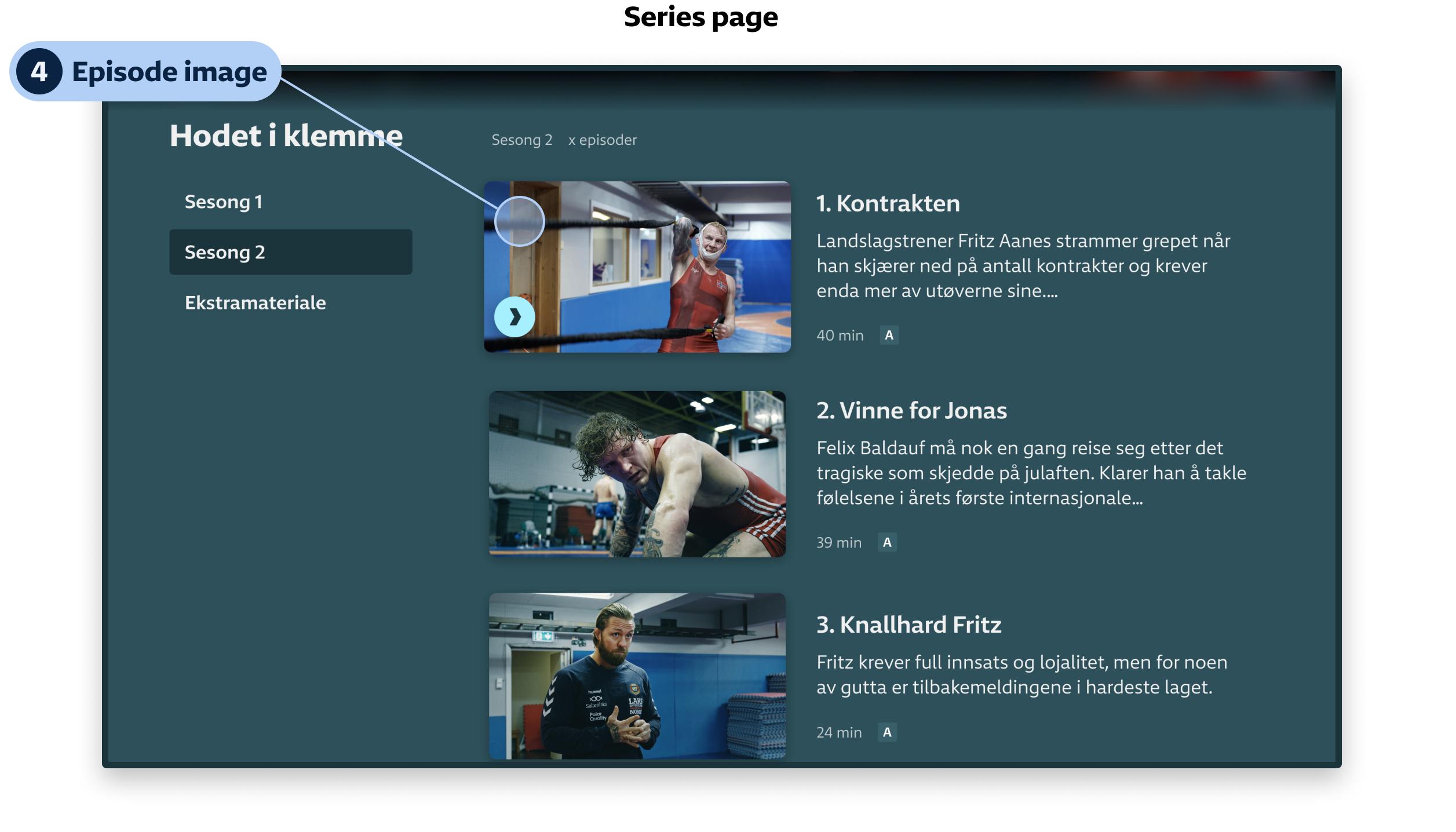
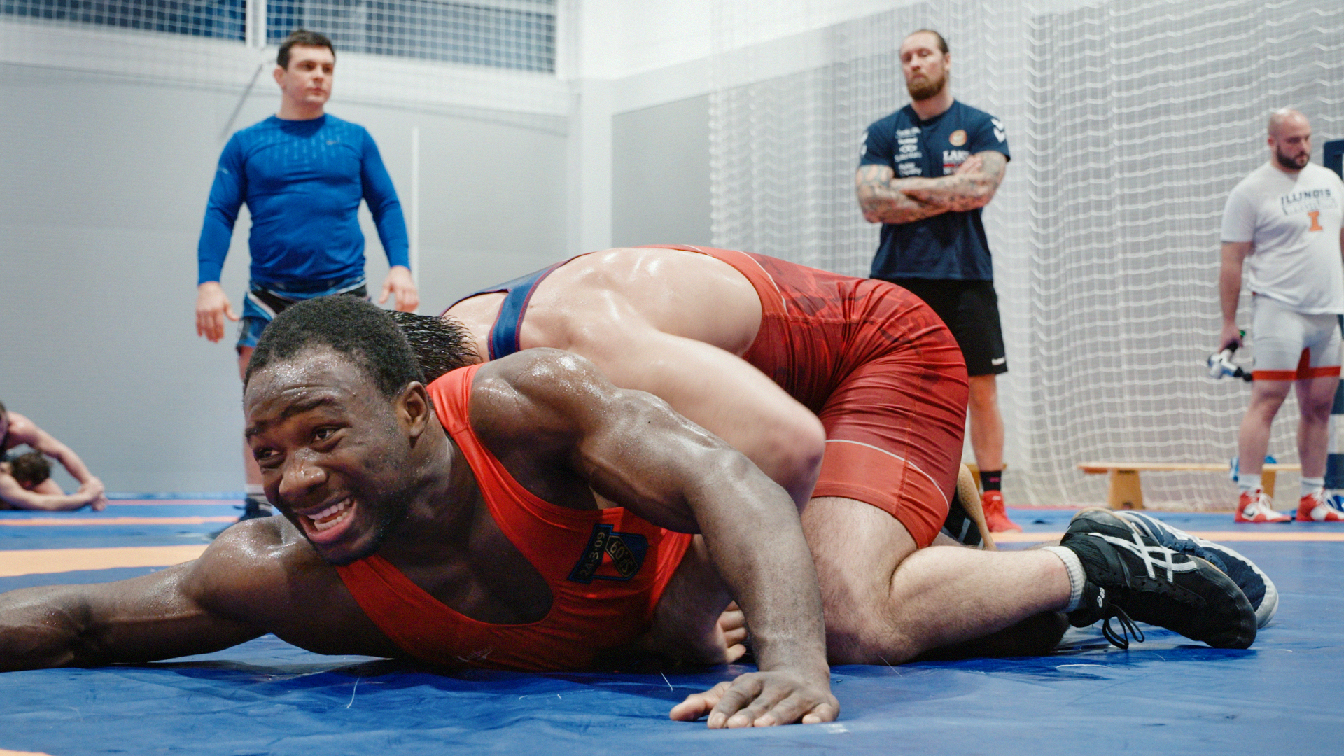
4. Episode images
Episode images should help the audience navigate the content so that they are able to quickly find the episode they are looking for. In addition, they help promote the content by visually representing what the audience may expect to see when they hit the play button.
Episode images should always:
- Work well with the episode title and description
- Represent the essence of the episode
- Be free of text, logo or other graphic elements
- Avoid spoilers
Specifications
| Type | Ratio | Size | Format | Note |
| Key art (landscape) | 16:9 | 3840 × 2160px | PSD og JPG | 1 per season . Logo/TT in separate layer |
| Key art (portrait) | 2:3 | 1280 × 1920px | PSD og JPG | 1 per season. Logo/TT in separate layer |
| Background image – designed | 16:9 | 3840 × 2160px | PSD og JPG | 2 per season. NO logo/TT |
| Background image – designed | 1:1 | 1920 × 1920 px | JPG | For mobile. NO logo/TT |
| Background image – realistic | 16:9 | 3840 × 2160px | JPG | 1 per season |
| Episode key art (landscape) | 16:9 | 3840 × 2160px | PSD og JPG | 1 per program. Logo/TT in separate layer |
| Episode key art (portrait) | 2:3 | 1280 × 1920px | PSD og JPG | 1 per program. LLogo/TT in separate layer |
| Episode image | 16:9 | 1920 × 1080px | JPG | 1-3 per episode. No logo/TT. Avoid spoilers |
All content must be approved ahead of delivery.
When approved, all content should be sent to [email protected] in accordance with the agreement: i.e. 30 days before the start of the license, unless otherwise agreed.
We require four types of pitch text:
- Series description
- Episode titles
- Episode description
The series description should pitch your series to viewers in one or two sentences, describing the contents optimally. Maximum 150 characters (including spaces). Currently the series description covers all seasons of an entire series in NRK TV. We are working to change that, but for now we need to keep the series description on a level that will cover all seasons.
For stand-alones, this should be a brief, good and catchy content description.
Maximum 150 characters (including spaces)
Example of a fiction series description
Norway is occupied by Nazi Germany. 11 soldiers risk their lives in possibly the most important raid on Norwegian soil. Norwegian drama series.
Example of a documentary series description
What happens when you call the ambulance? We follow the crews who take care of those who are having their worst day ever. Norwegian documentary series.
Any programme or series divided into episodes requires brief episode titles.
A brief description of each episode – or of the programme, if it is stand-alone.
In a continuous narrative series, these descriptions function as a navigation aid to give the viewer a feel for the episode content – without spoiling.
Maximum 150 characters (including spaces)